Kasper
Culture, concept, motion-led
Christiansen
Designer PODIMO
Case - Deep dive
DTU Earthbound
Visual strategy and brand rollout for a complex knowledge hub
Humanizing abstract climate tech demanded a new CVI. By transforming dense research into relatable stories, we ensured a consistent visual experience across all digital and physical touchpoints.
Process
The core
A cohesive and recognizable visual identity across the entire user journey, tailored to specific audiences, messages, and channels. This drove a 300% increase in social media engagement and interaction.
By developing an extensive brand library and CVI guidelines, we ensured a consistent look and feel from LinkedIn content to physical outdoor media and event assets.
LinkedIn focus
Low visibility in a crowded market demanded a bold visual identity. By implementing custom graphic elements, dynamic animations, and video assets, we boosted organic LinkedIn reach from 5,000 to 45,000.
4x increase in LinkedIn visibility
5K to 45K
Organic views in 3 months.
Growth in followers
8 to 1.2k
New followers from the target audience.
2x increase in engagement
5 to 1.5k
Community engagement, interactions, and comments.
Brand asset library
Scaling visual content and simplifying complex information required streamlined workflows. This led to the development of plug-and-play templates across Figma, Adobe, and PowerPoint.
Deploying templates for ads, campaigns, educational materials, and outdoor media slashed production time while ensuring every asset remained strictly on-brand.
From event invitations and spatial design to SoMe concepts, we created a cohesive user journey that strengthened the sense of community.


Behind the design process
We implemented the visual identity through an extensive library of systematic templates, grids, and guides. This ensured a cohesive and recognizable design across every digital and physical touchpoint of the user journey.
Through rapid prototyping, we built layouts and sitemaps, testing web designs and user flows across all platforms from Notion-based application processes to newsletter systems.


Image style and photography
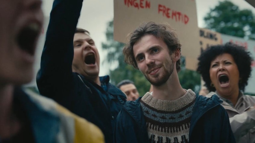
Communicating complex scientific processes required an added visual layer. Using a documentary style “in situ” photography approach, we transformed abstract ideas and tech into relatable content. By telling the story through the eyes of the innovators, we significantly strengthened the sense of community.


Social media concept
To showcase the human side of scientific tech, we adopted an informal “conversation style” approach. By capturing raw stories of process and courage in short-form formats, we made complex innovation feel personal and relatable.
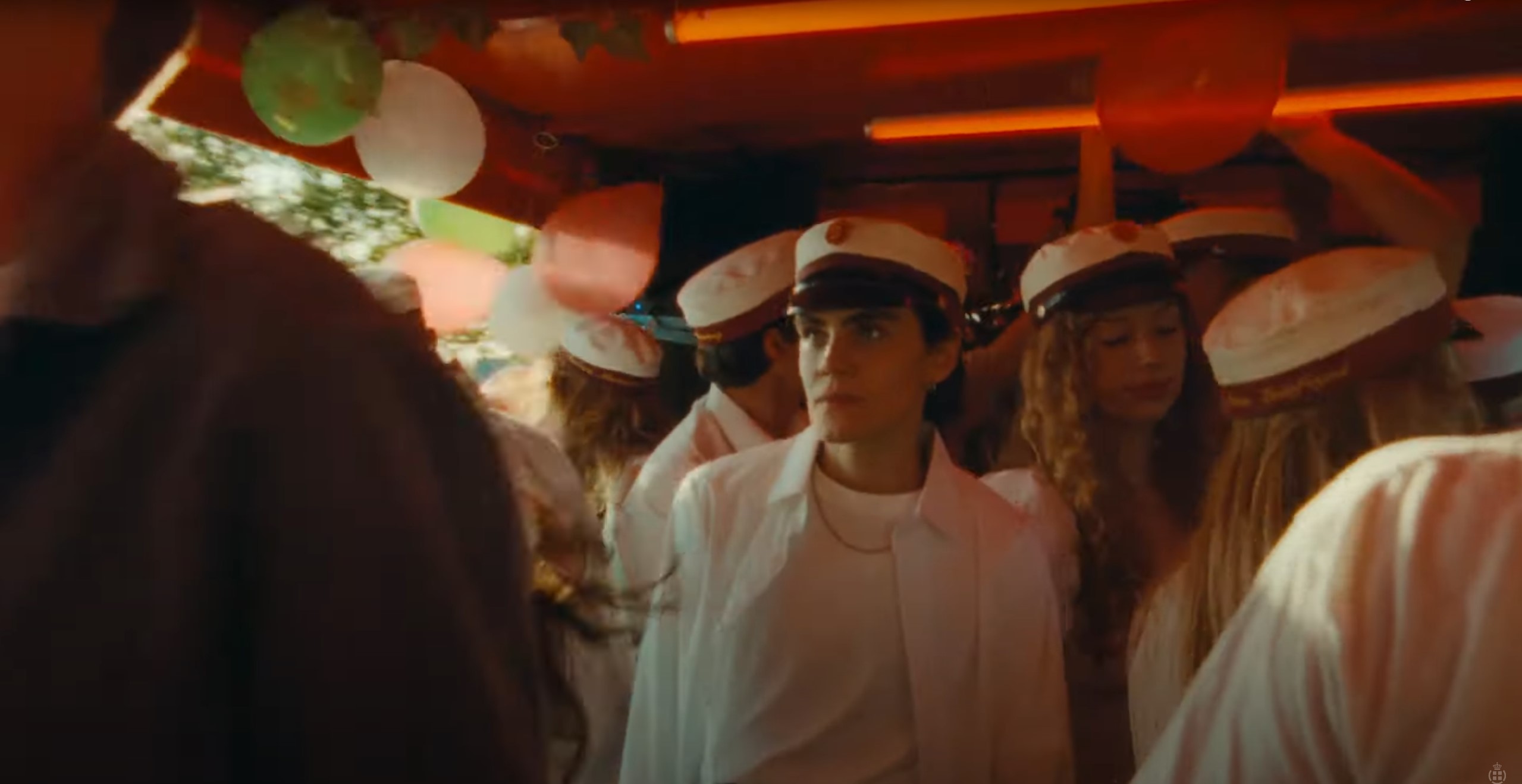
Case - Deep dive
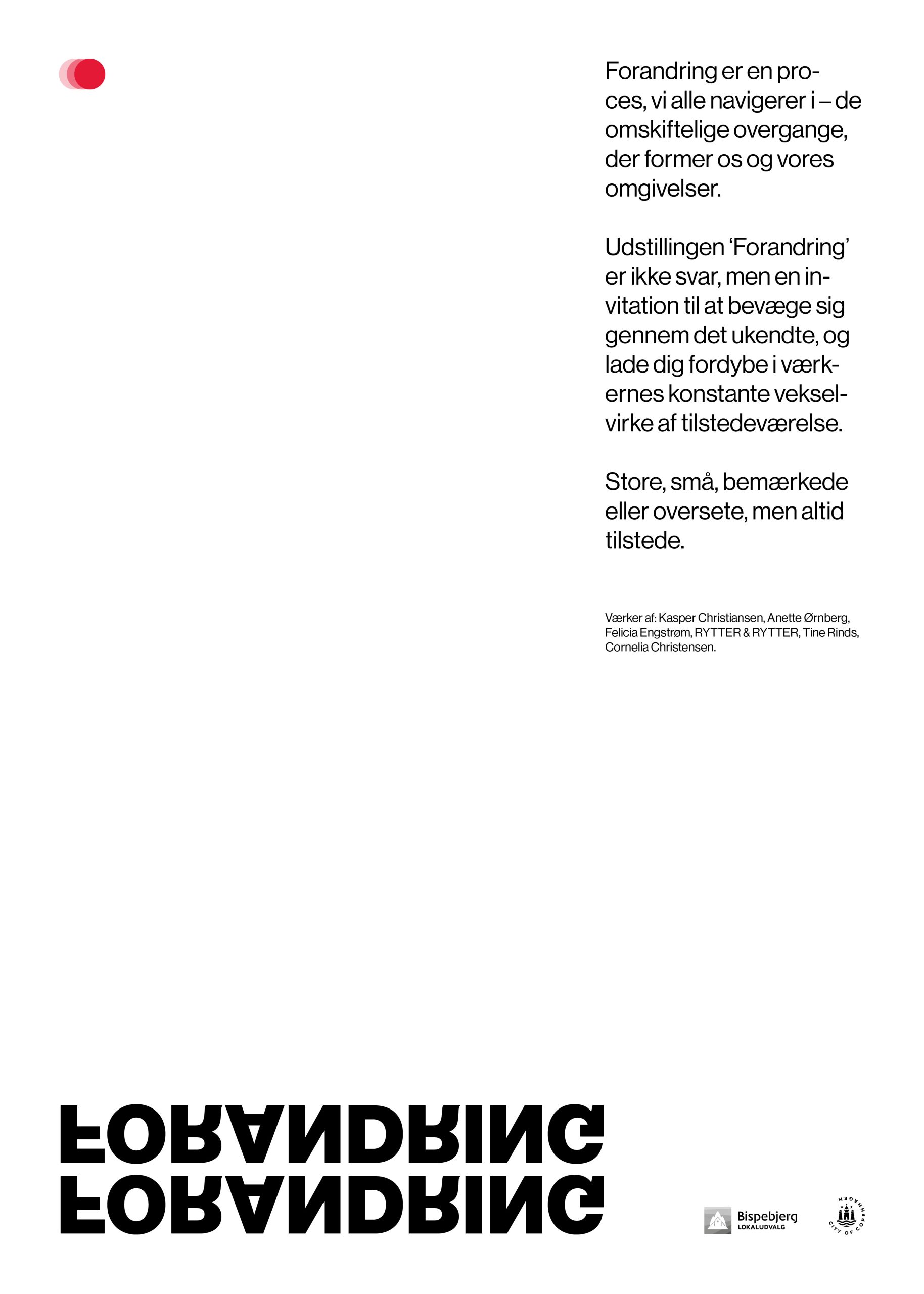
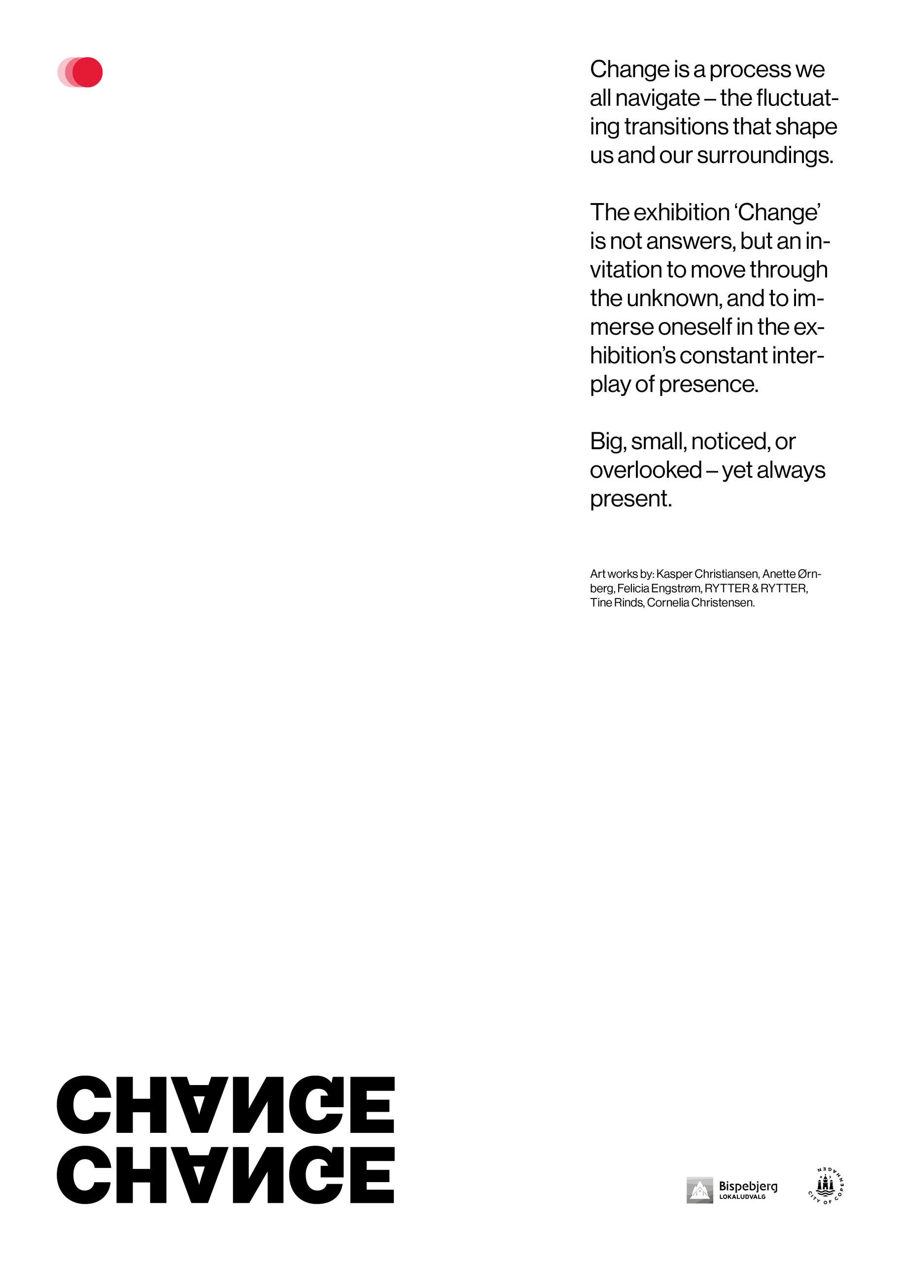
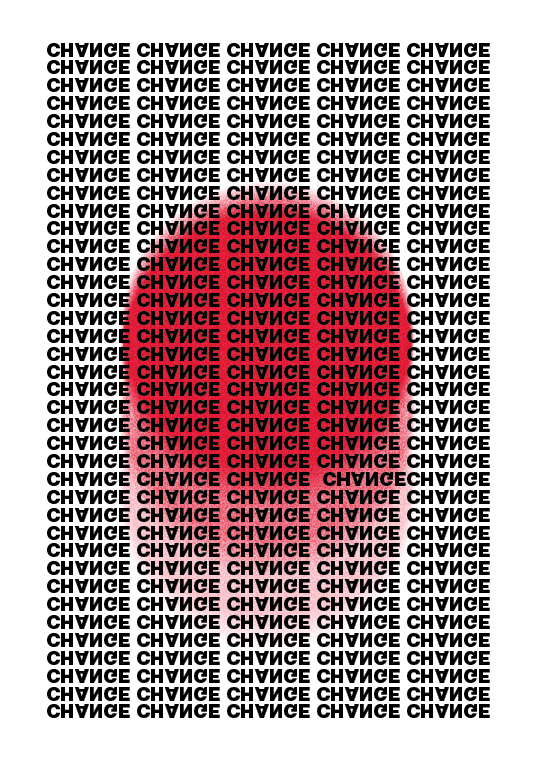
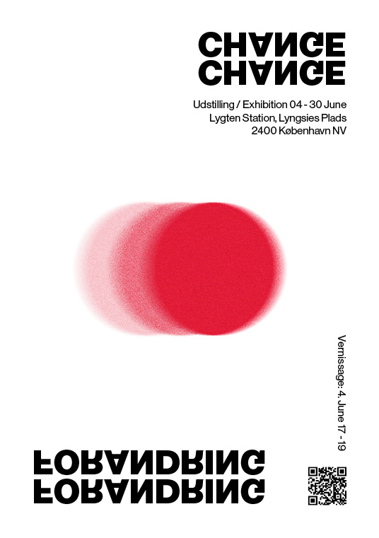
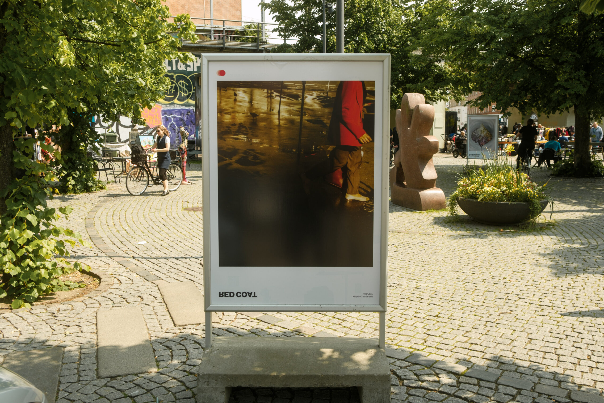
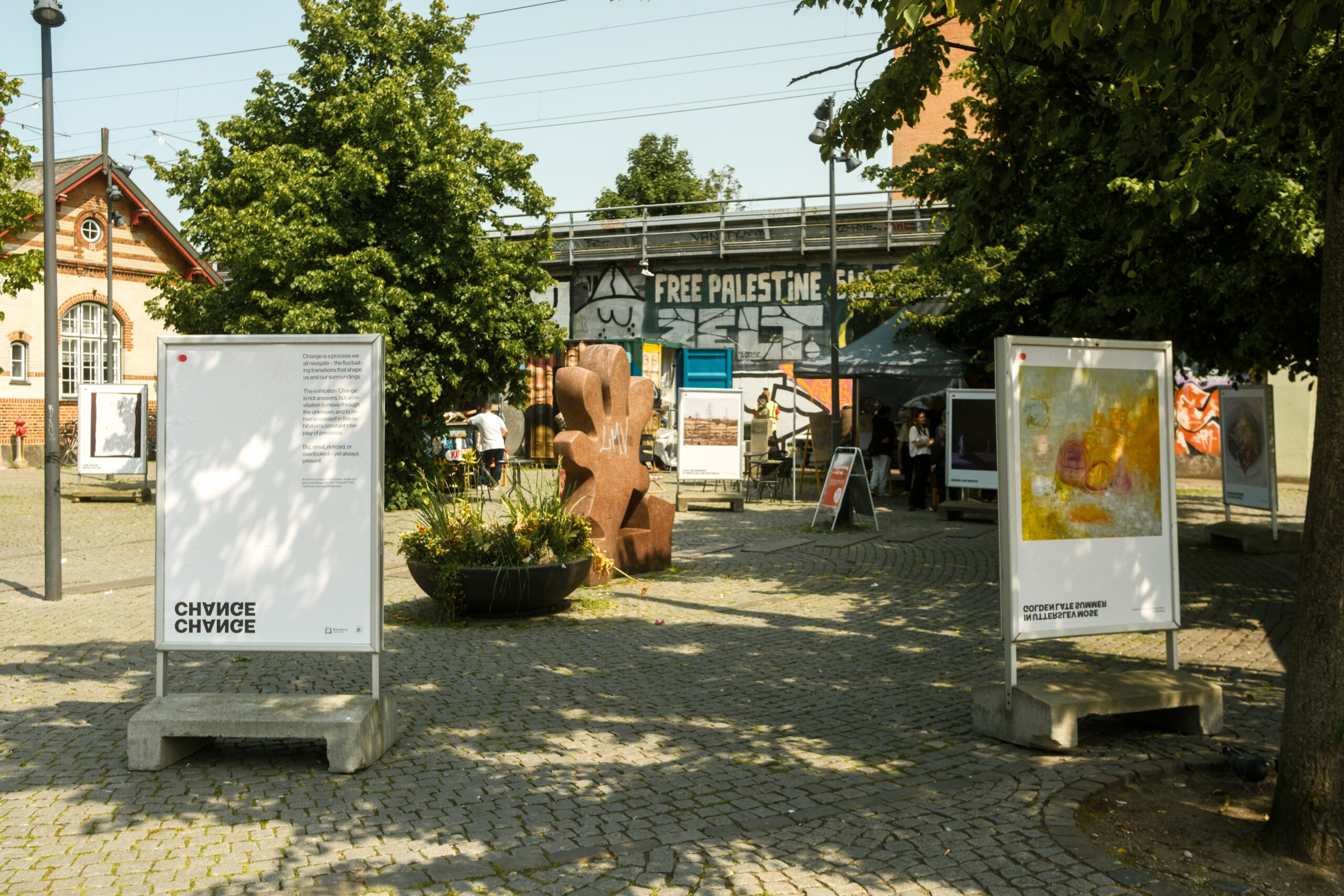
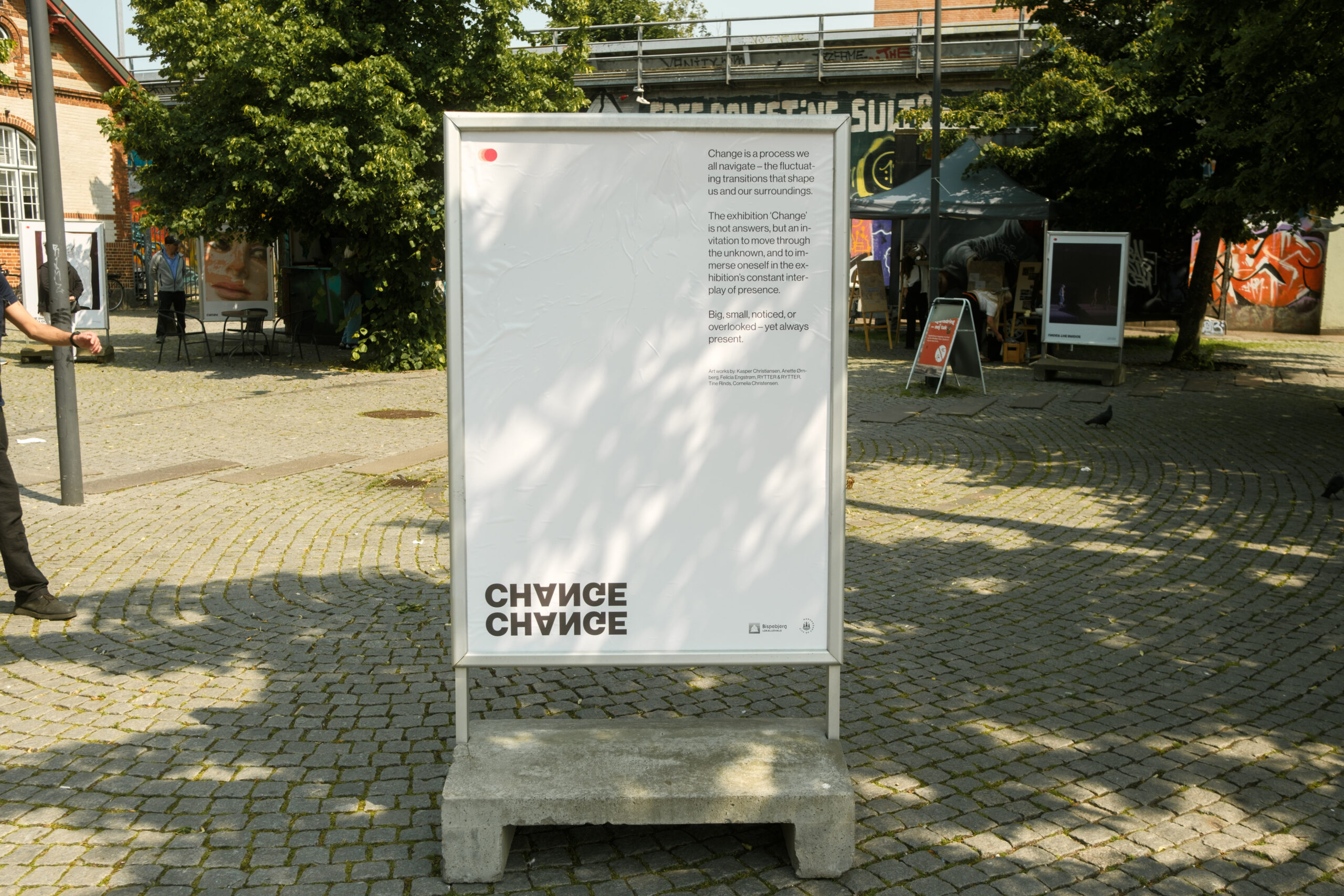
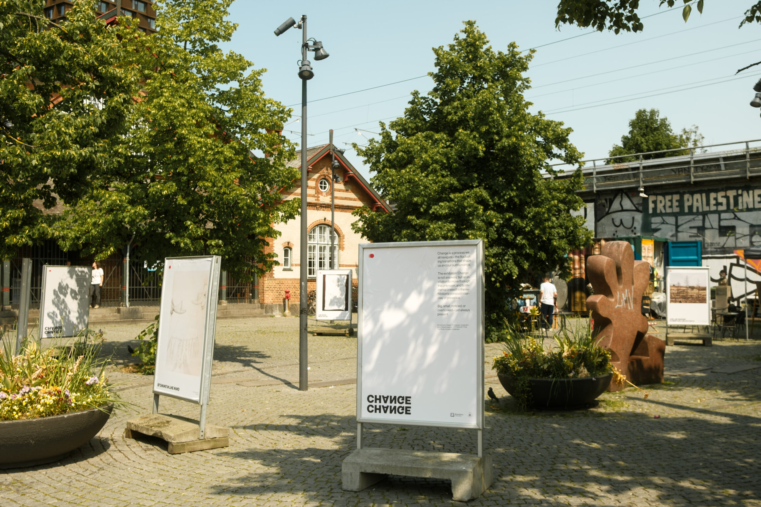
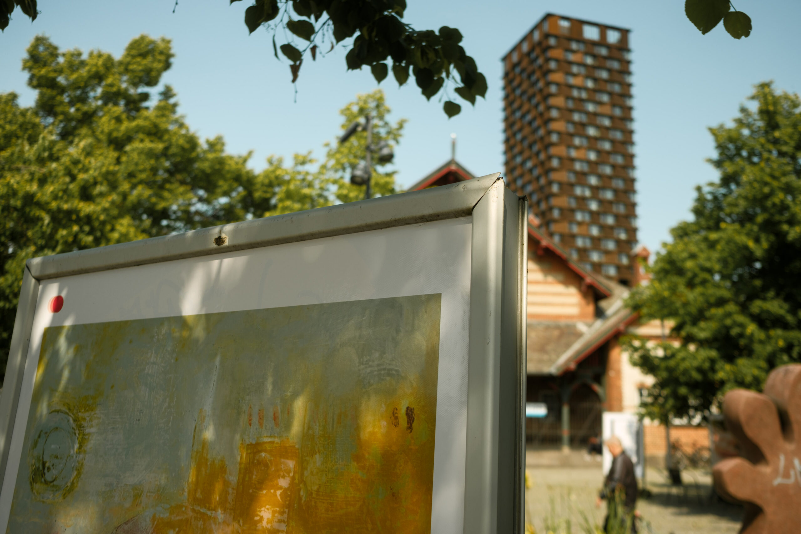
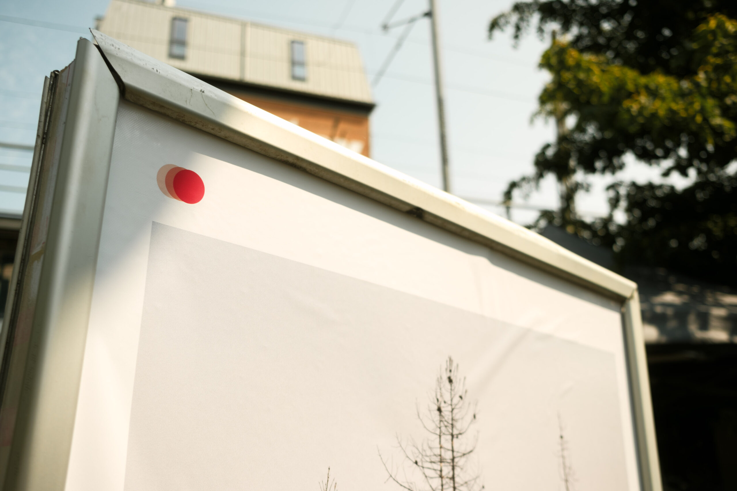
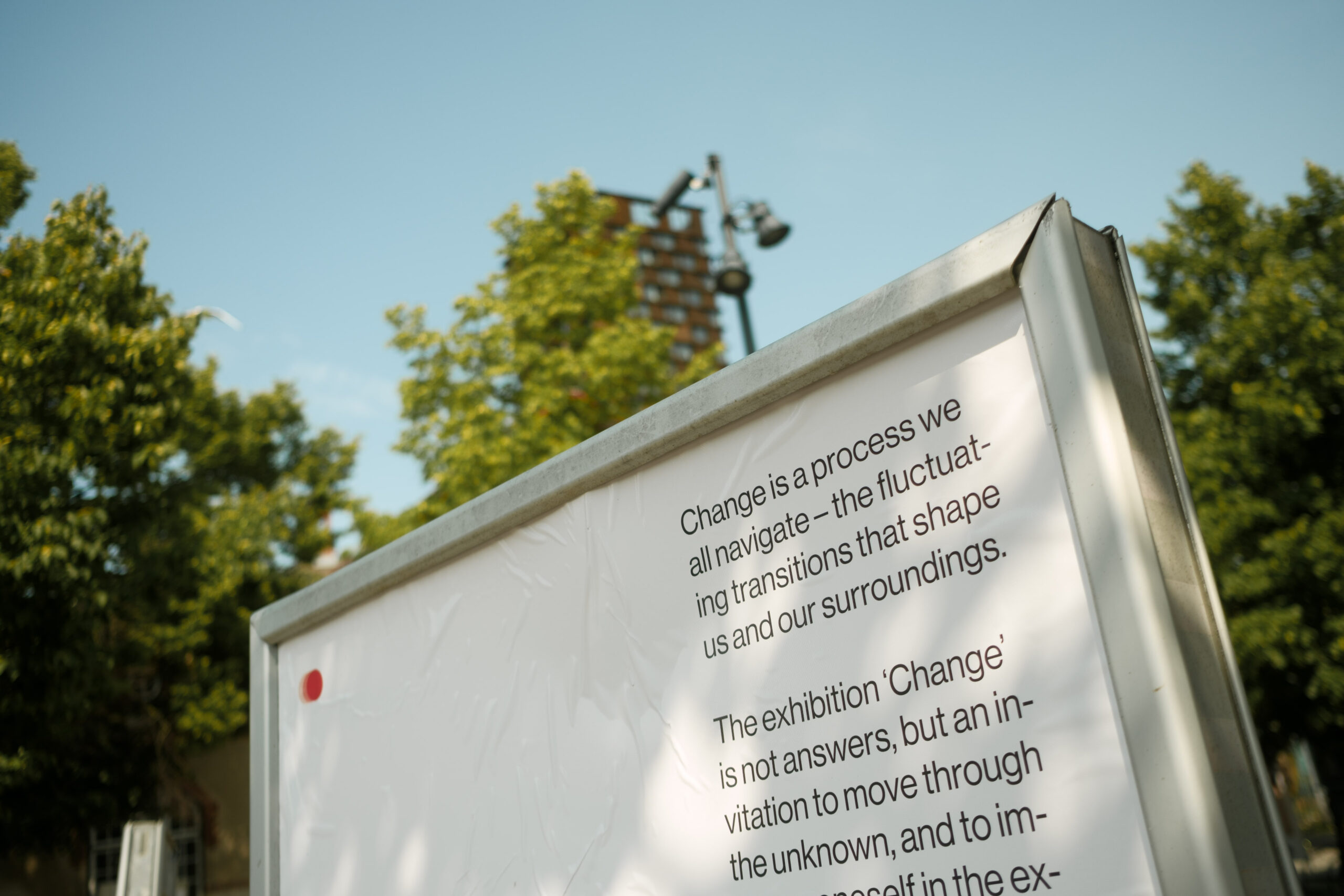
Change
Visual identity and urban outdoor execution
I had a vision:
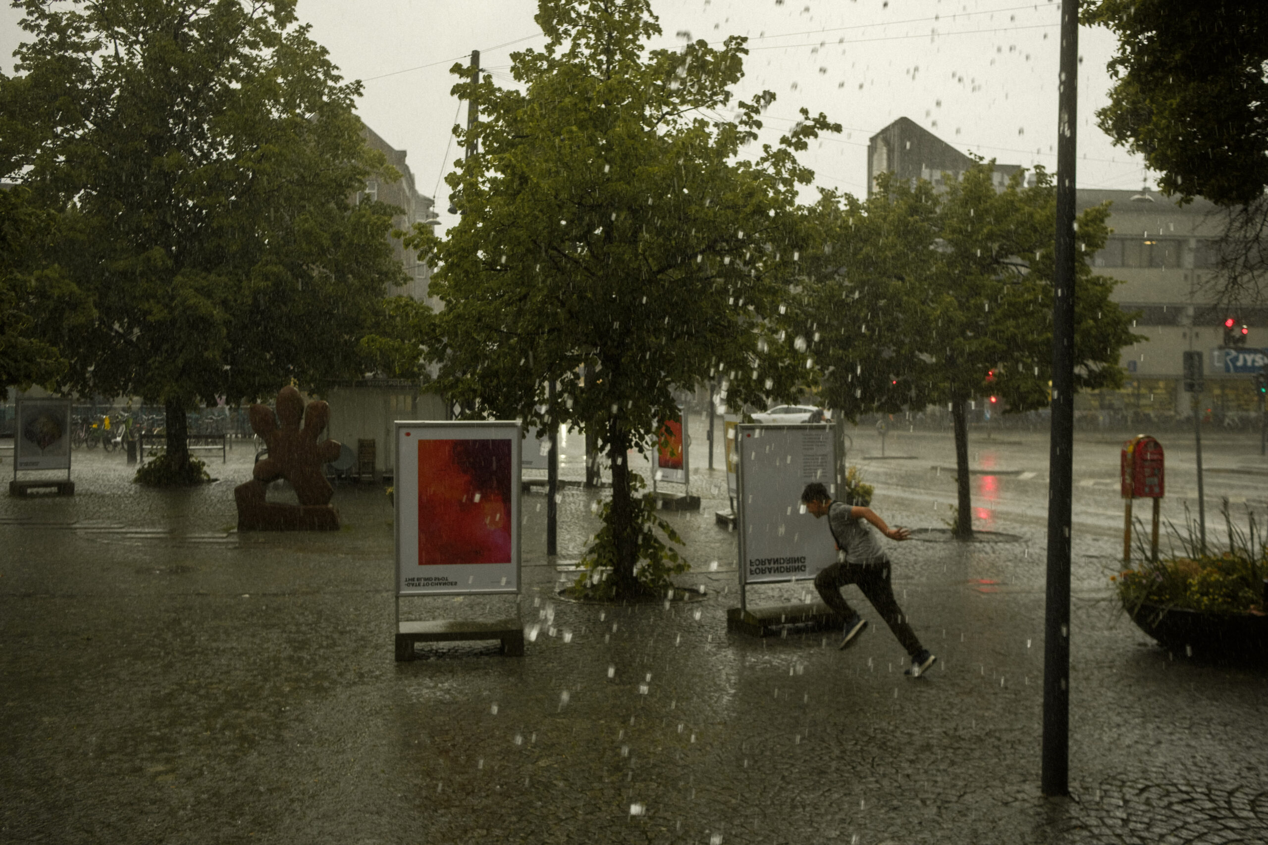
To transform Lyngsies Plads,a bustling transport hub by Nørrebro and Lygten Station into an exhibition platform that disrupted the daily routines of commuters. This required a visual identity designed to grab attention in 3–4 seconds and invite immediate interaction.
Process
The core
How do you ensure instant recognition in the public sphere?
The core idea was to subtly shift the perception of the space, offering a brief disruption to the daily routine. I designed a visual identity that was versatile yet cohesive, allowing each artist’s work to shine while maintaining a unified narrative of “constant change.”
The risk of visual noise in a high traffic hub required strategic precision. By meticulously selecting the color palette, typography, scale, and spatial placement, we guided the audience’s attention and invited cultural immersion, even on the move.
Behind the design process
Streamlined communication for partners and artists. A clear vision made visual and easy to grasp.
(This approach served as an effective “trial and error” phase, allowing for refinement before going to print.)


Visual identity
Strategic design choices, a tight color palette, and purposeful typography guided the audience’s attention. This created spatial coherence across information and eight unique artistic expressions uniform yet distinct.
Logo


SoMe marketing


Many roles at once
I developed the project proposal, secured funding, established partnerships, and curated the exhibiting artists.
The project required wearing multiple hats to coordinate between the City of Copenhagen, the Bispebjerg Local Committee, and Lygten Station, ensuring local roots and technical feasibility. The goal was to transform a busy square into a relatable exhibition space for the city’s commuters.
Recognizing that public activities must integrate with the natural flow of the space, I collaborated closely with local organizations to ensure the project was deeply embedded in the community. This partnership allowed us to leverage the area’s existing cultural identity and create a true sense of ownership.
A unique sign of respect for the exhibition: throughout the entire period, the info stands remained untouched by graffiti on a square that is otherwise in a constant state of change.
The project is supported by:
Lygten St. Area Renewal, Bispebjergbakke, Copenhagen Municipality, and Bispebjerg Local Committee with 25,000 DKK.
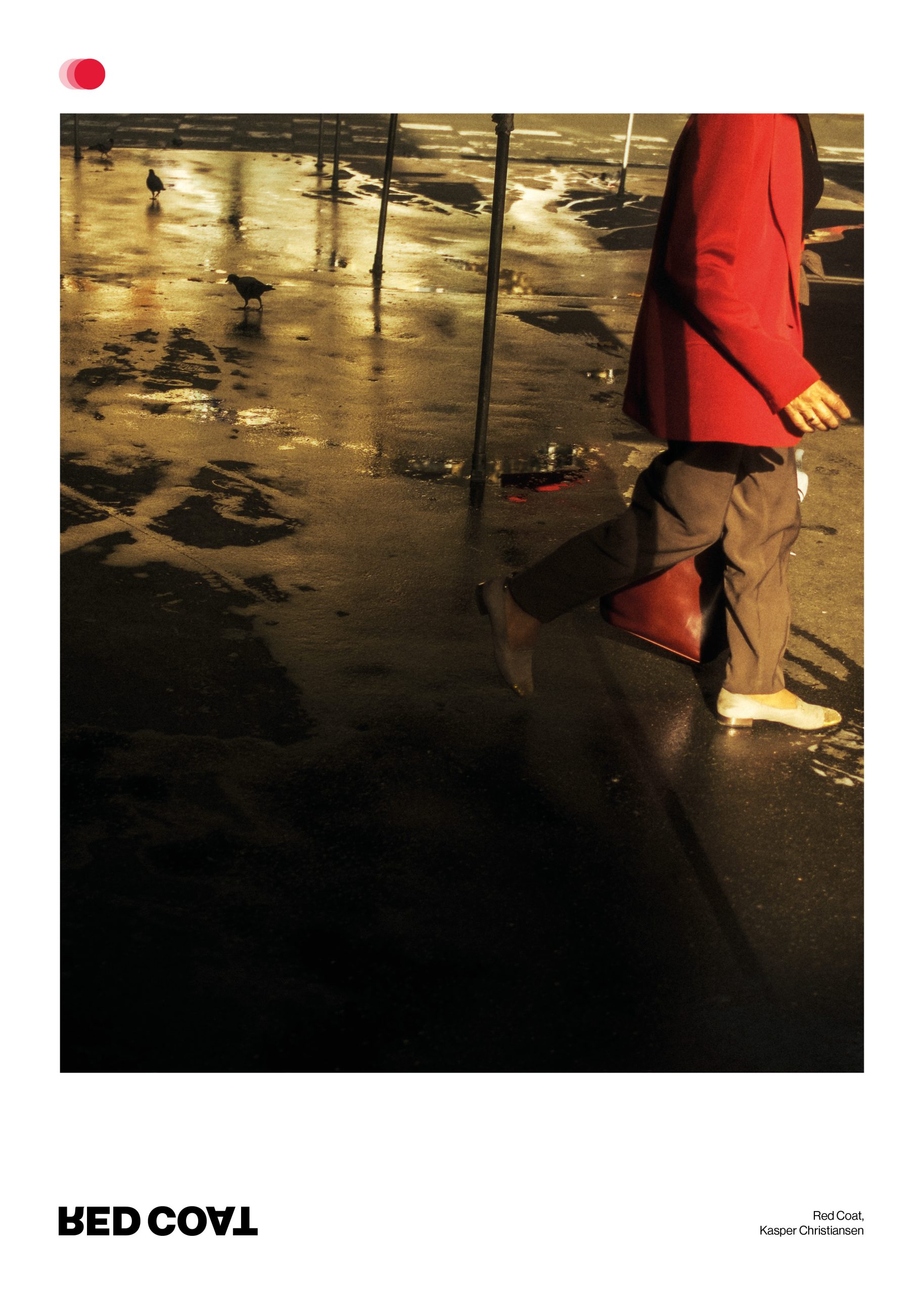
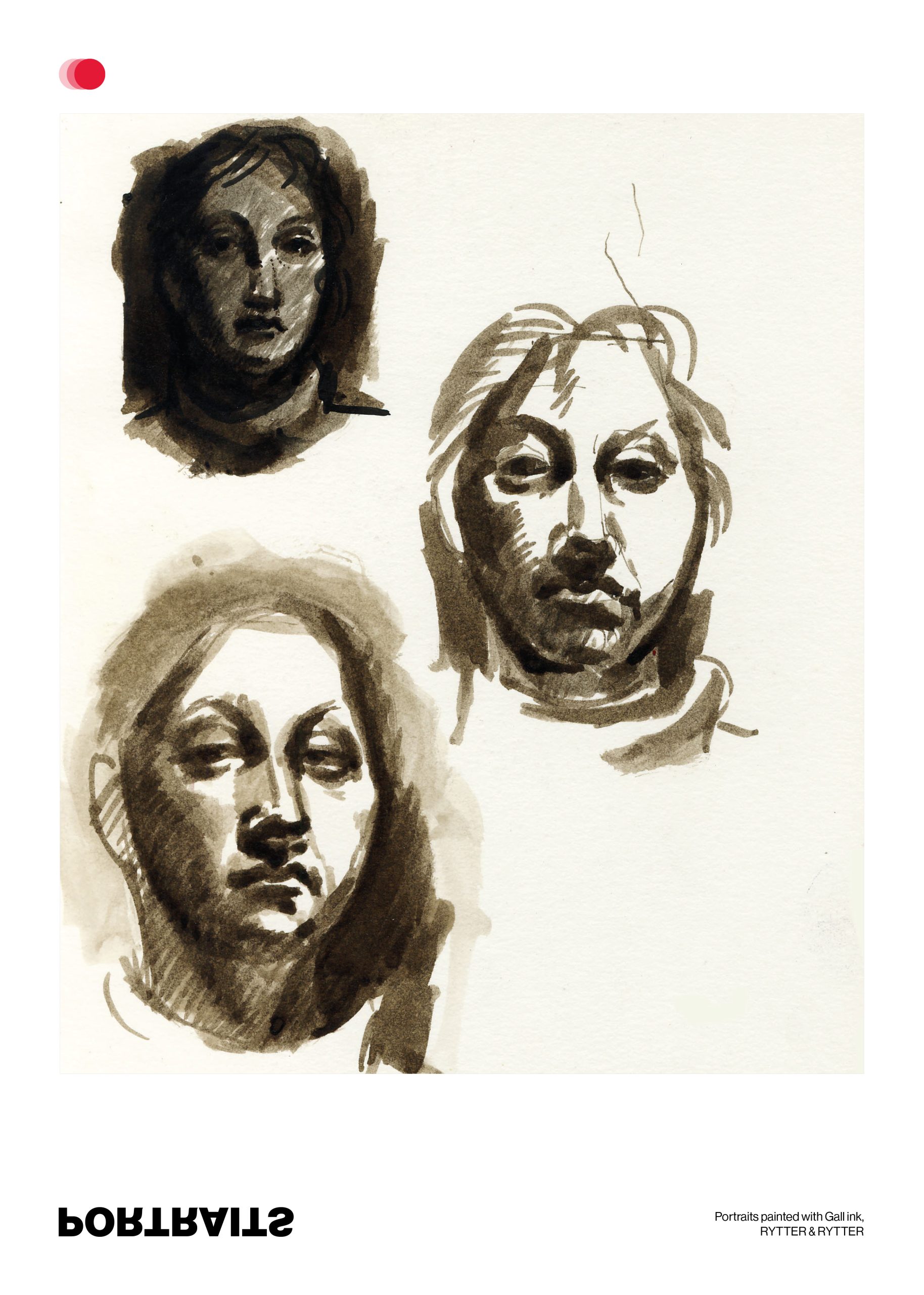
Exhibiting artists:
Kasper Christiansen, Anette Ørnberg, Felicia Engstrøm, RYTTER & RYTTER, Tine Rinds, Cornelia Christensen.
Case - Deep dive
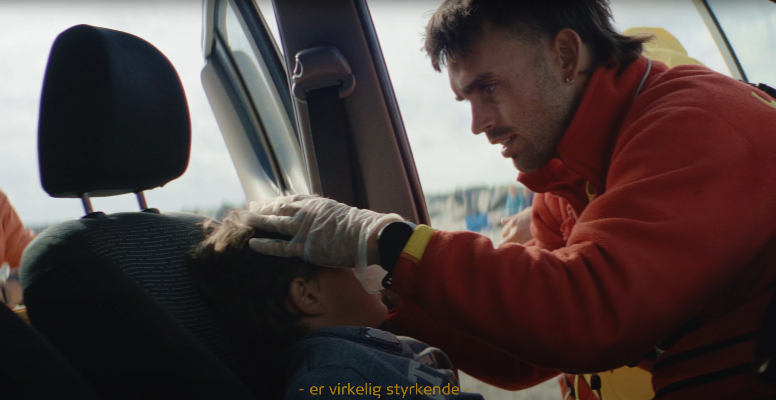
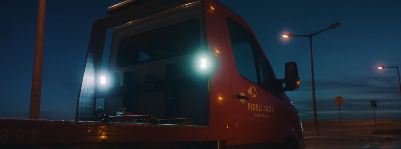
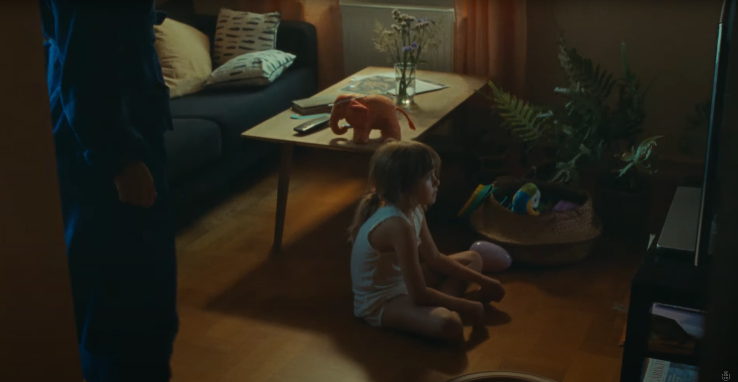
Safe Consult
Development of visual identity
Safe Consult empowers businesses and citizens by building courage and practical skills through interactive courses. We enable people to act swiftly and decisively, fostering a safer everyday life and a stronger community.
Process
Branding strategy
IDENTITY
Safe Consult fosters safety and solidarity through compassionate, engaging courses in first aid and crisis management. Our mission is to empower individuals to act with care and responsibility in their everyday lives.
WHY
Safe Consult exists to empower people with the skills and confidence to help one another in critical and challenging situations. We are driven by a vision of a society where everyone takes responsibility for each other’s safety and well-being.
Our purpose is to make compassion and action accessible to all through engaging, hands-on learning experiences that inspire courage and accountability.
Together, we can build safe and supportive communities.
POSITIONING
For Danish businesses and citizens seeking to foster safety and security in everyday life, Safe Consult offers compassionate, engaging courses that empower them to act in critical situations by combining authentic care with practical, active learning.
Values
HUMANITY
We put people at the center and build courses that strengthen empathy and responsibility.
CREDIBILITY
We offer knowledge and skills with authenticity and integrity.
POWER OF ACTION
We give people the courage to act in critical situations and prepare them to protect those they love.
Typography
A B C D E F G H I J K L M N O P Q R S T U V W X Y Z
a b c d e f g h i j k l m n o p q r s t u v w x y z
Color palette
Blue
#162B4C
Peace, calm, tranquility, devotion, sincerity, honor, steadfastness, reliability, loyalty.
Yellow
#FFDD80
Joy, happiness, optimism, idealism, imagination, hope, light, intelligence, knowledge, learning, concentration, self-confidence.
Green
#CAE4CD
Nature, environment, health, masculinity, calming, renewal, energy, spring, generosity, freshness.
White
#FFFFFF
Reverence, purity, simplicity, peace, truth, honor, protection, humility, precision.
Black
#000000
Committed, serious, powerful, authoritarian, refined, formal, elegant.
Logo design


Case - Deep dive
Publications
Selected layouts and publications
Milestone
Milestone Systems offers video technology software.
With a desire to move away from their Minority Report-style visual expression, a different “people-focused” profile emerged.


Experimenting
Video animation posters
A very experimental digital poster format. Inspired by a small linoleum print that hung on the 4th floor, in the Centre Pompidou, Paris. All the way down in a hidden corner.
Everything Creatively "type of guy"

About
Since 2014, I have tackled projects of all scales, shapes, and budgets. What unites them is that they always begin with a conversation and a desire to tell a story. Ideas need a solid foundation and careful nurturing to become meaningful experiences. Whether it’s a product, information, or a deeper brand understanding, it requires intentional choices and the right actions to take root and flourish.
From local Copenhagen initiatives to international European projects, I have developed, produced, and project managed strategic efforts to share visual identities and stories. Through relatable, high-impact content, I build bridges and create universal connections—informed by cross cultural data and deep contextual insights.
What i do
I have collaborated with entrepreneurs, cultural institutions, and brands to shape their narratives with clarity, emotion, and purpose. Whether launching an event, reinventing an identity, or crafting a unique story, I help transform vision into form, expression, and emotional resonance.
Clients
Rise Europe, Malmö Opera, Copenhagen Municipality, DTU Eartbound, UnternehmerTUM GmbH, National Federation of Swedish Art Societies, Technical University of Denmark, Between Music, Copenhagen Business School, DTU Skylab, Sunraker, Catch and Helsingør Municipality, Kunstpatruljen, Forest of the world.
Agencies
Danish Broadcasting Corporation, Duckling, Farsight TV, Cosmo Film, Metronome.
Exhibitions, awards and screenings
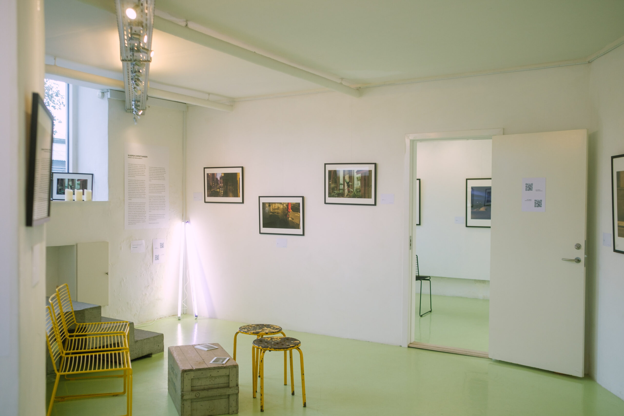
Gallery Flyvsk, Copenhagen
Solo Exhibition, Copenhagen
Photography
2024
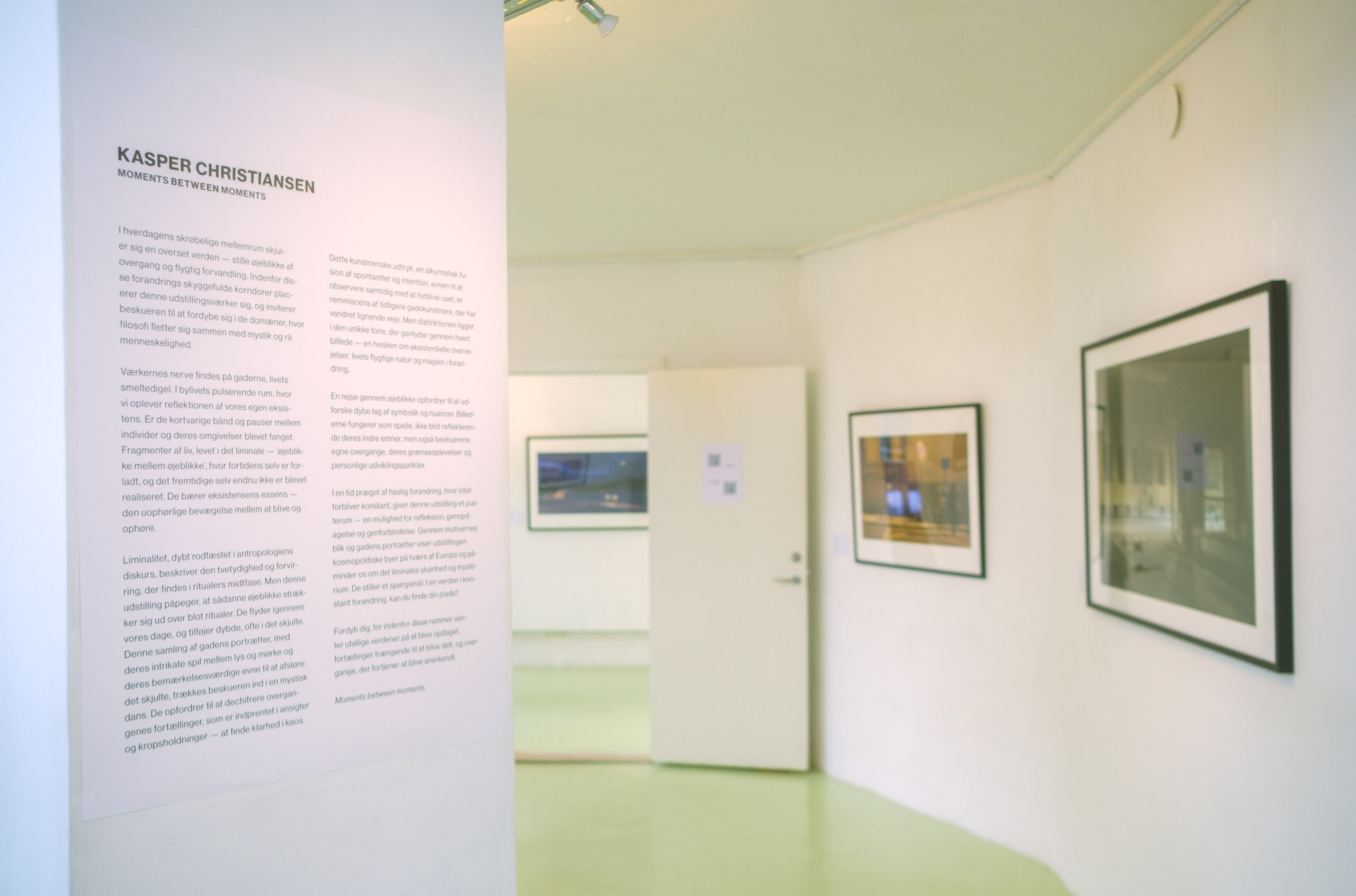
PORTRAITS – Hellerau Photography Awards
Censored Exhibition, Dresden
Photography
2023
Digital Chroma Agency
Censored Exhibition, Berlin.
Photography and Film
2022
DELETE TV
Screening, London
Film
2022
Young Danish Contemporary Artists
Censored Exhibition, Vraa
Photography
2022
Bomba Video Club
Screening, Moscow
Film
2022
Milan Gold Awards
Award winner
Film
2021
EdiPlay International Film Festival
Award winner
Film
2021
Paris Film Festival
Award winner
Film
2021
Nordisk Salong
Censored Exhibition, Helsingborg
Photography
2021
Falcon International Film Festival
Award winner
Film
2021
Artists' Summer Exhibition
Censored Exhibition, Copenhagen
Photography
2021
Florence Film Awards
Award winner, Florence
Film
2021
YICCA International Contest of Contemporary Art
1st place winner, Exhibition, Milano
Photography
2021
ARFF Berlin // International Awards
Honorable Mention
Film
2021
Copenhagen Business School
Solo Exhibition, Copenhagen
Photography
2021
Amsterdam Short Film Festival
Screening
Film
2021
Fotofestival Schiedam
Censored Exhibition, Copenhagen
Fotografi
2021
Output Aarhus
Censored Exhibition, Aarhus
Photography
2021
Stockholm City Film Festival
Screening
Film
2021
Charlottenborg Spring Exhibition
Censored Exhibition, Copenhagen
Photography
2020
Copenhagen Photo Festival 2019
Censored Exhibition, Copenhagen
Photography
2019
Berlin Sci-Fi Festival
Official Selection
Film
2018
Aarhus Independent Pixels
Censored Exhibition
Photography


